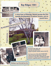
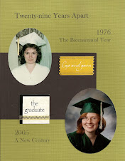
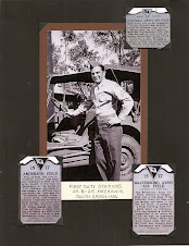
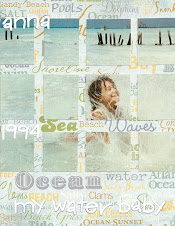
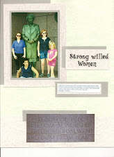
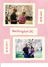
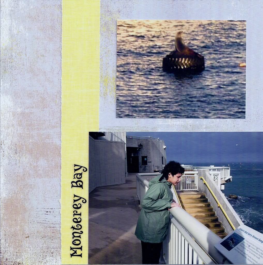
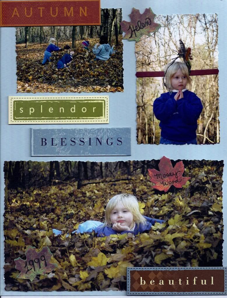
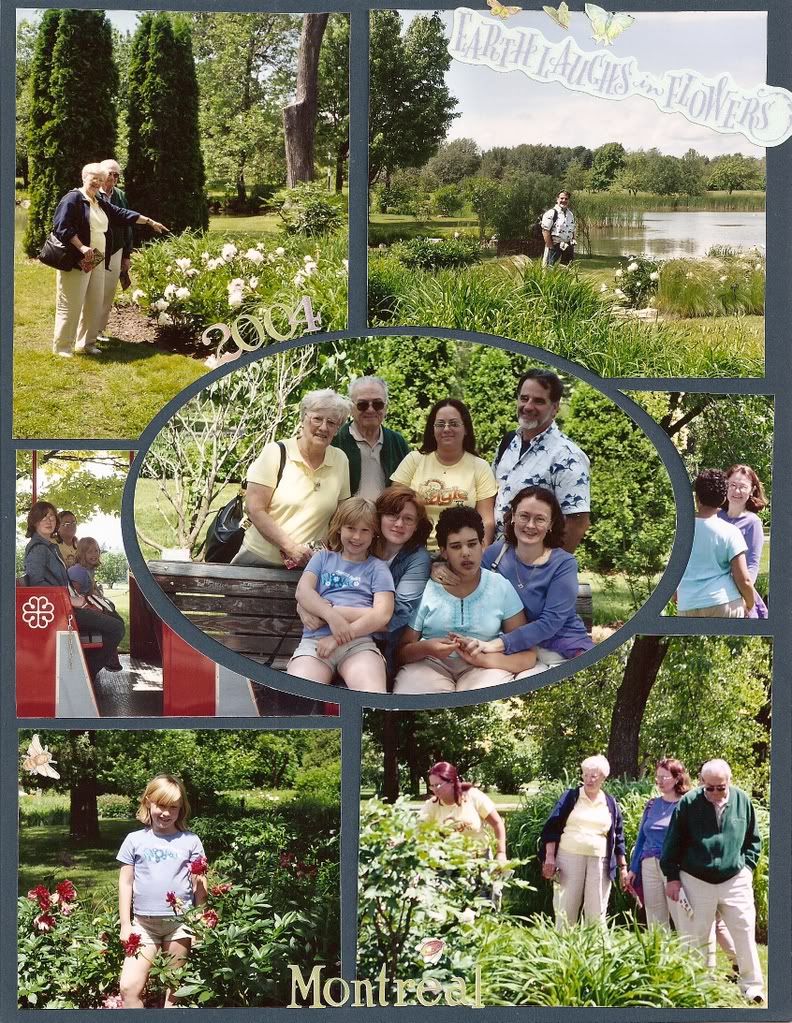
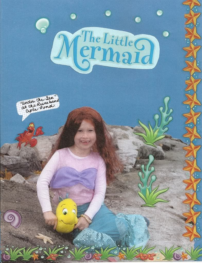
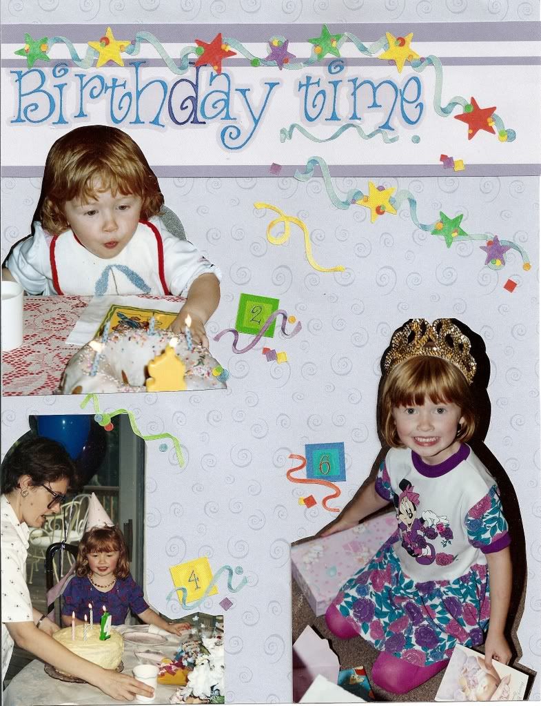
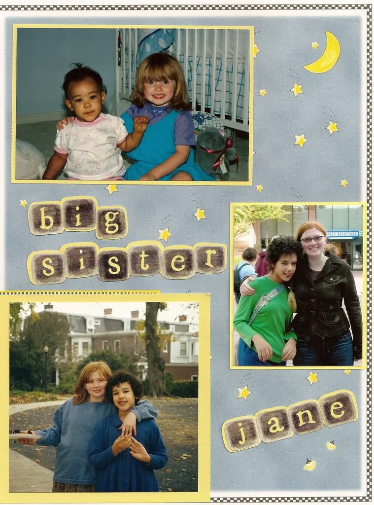
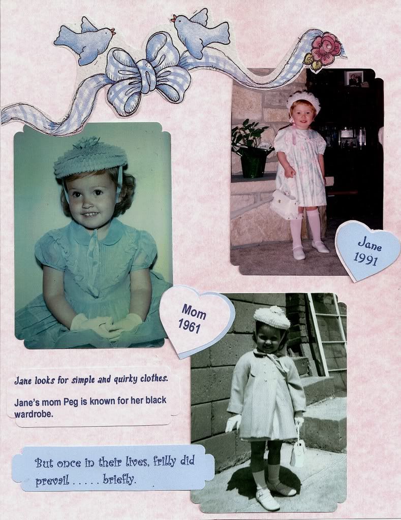
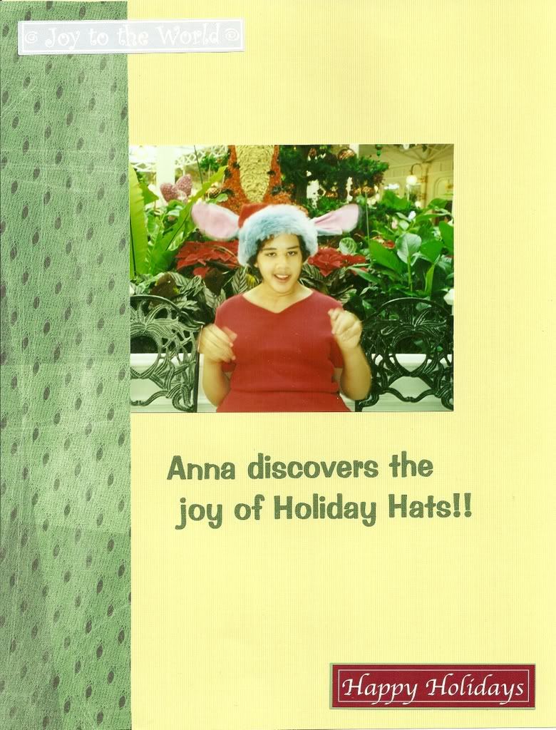
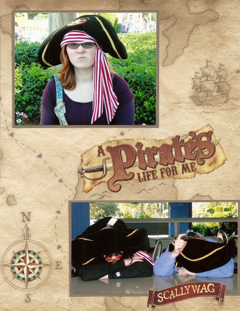
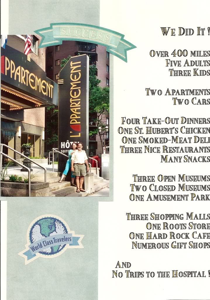
As a practical scrapbooker, I prefer simple uncluttered scrapbook layouts.
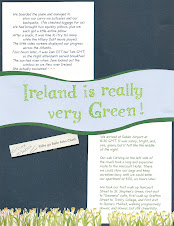
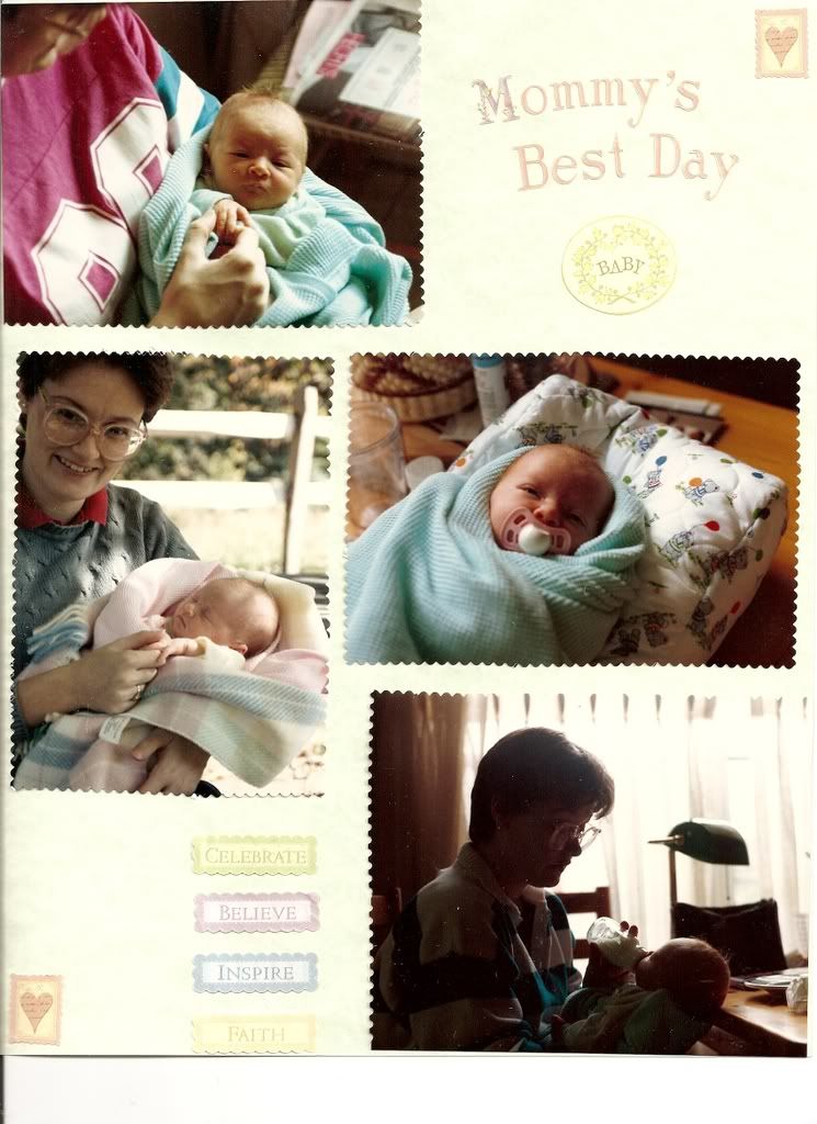
Most of my scrapbook pages have a solid background, three or four matted photos or elements that flow from upper left to lower right, with geometric borders, captions that work as titles and few embellishments. I buy lots of embellishments, but use a strategic few to avoid looking cluttered or fussy, From that simple formula, I have created many different scrapbook pages that do not look simple.
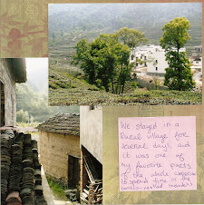
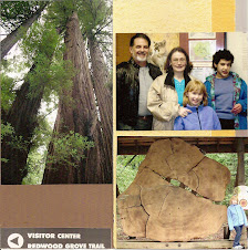
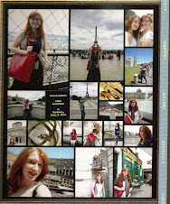
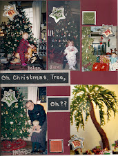
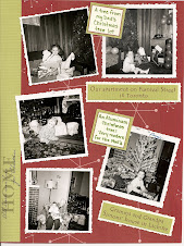
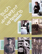
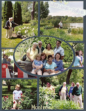
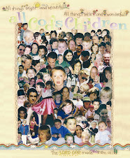
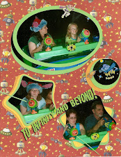
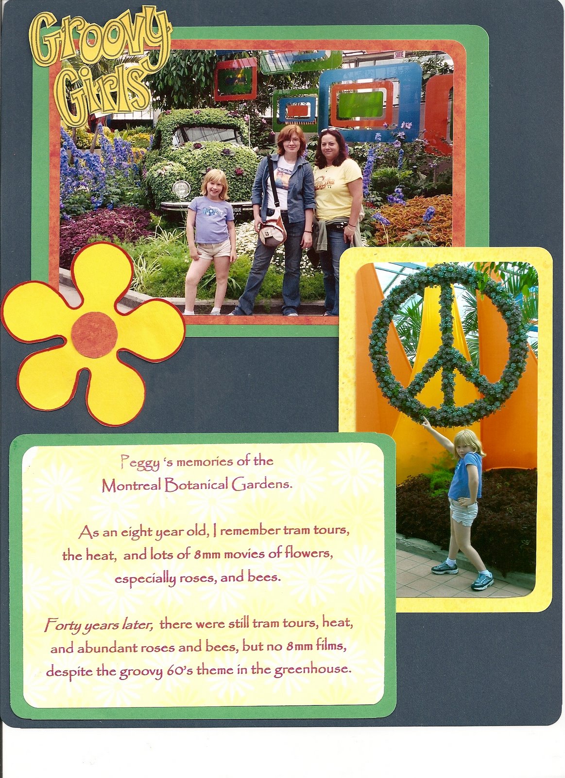
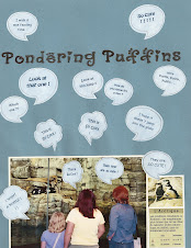
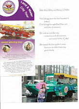
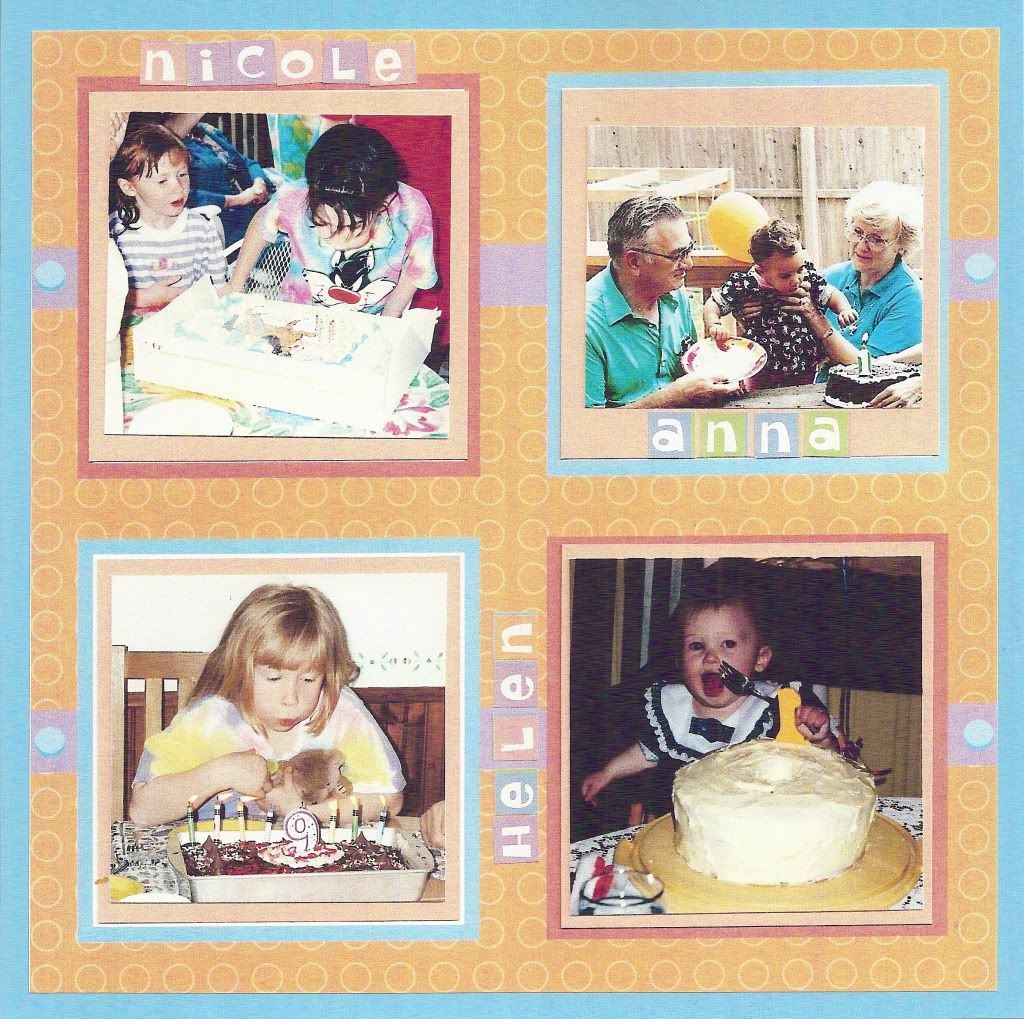
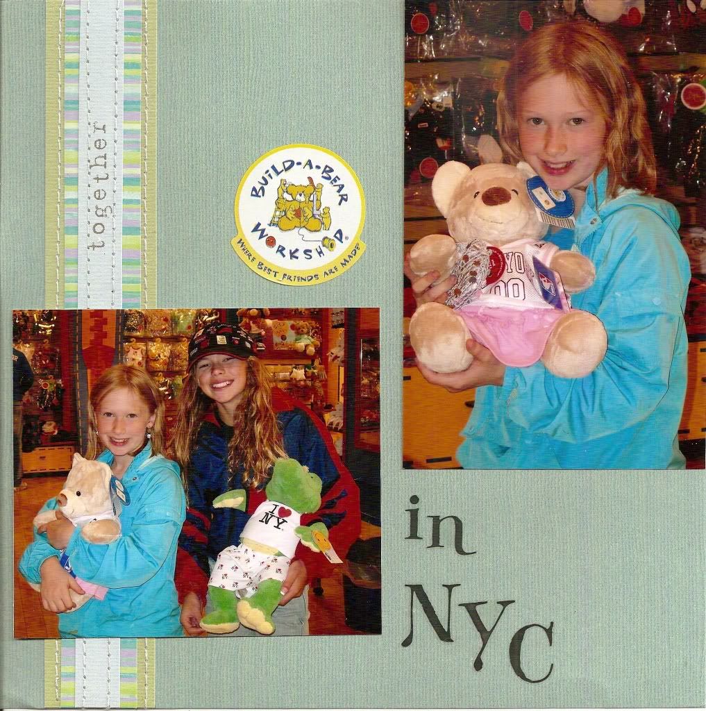
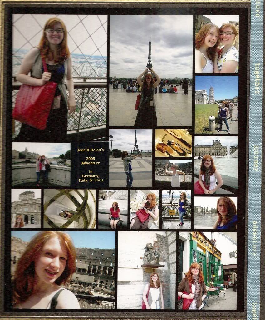
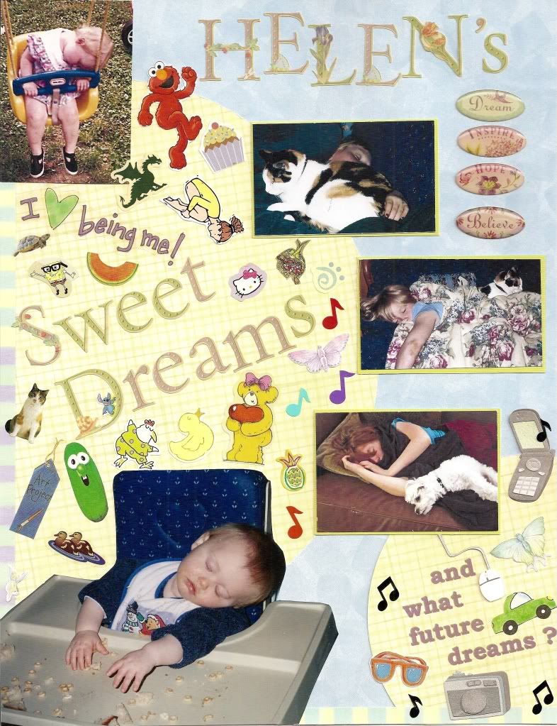
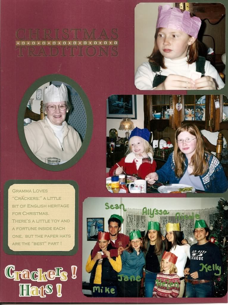
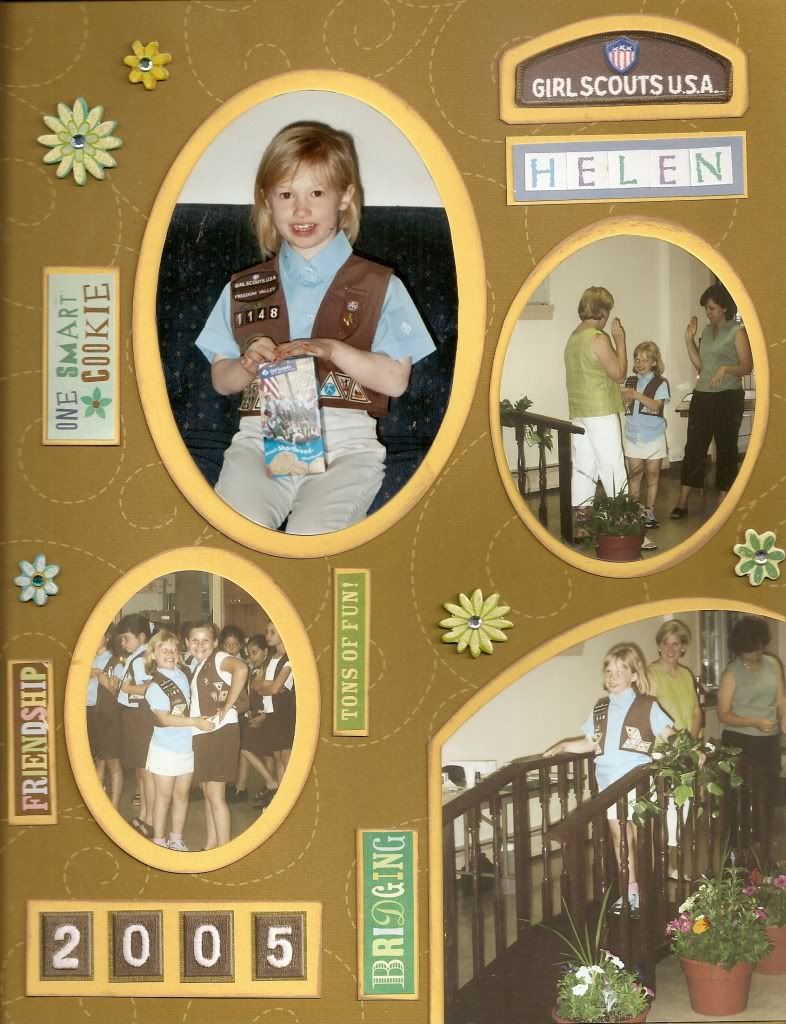
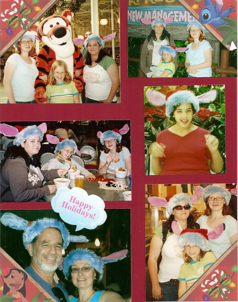
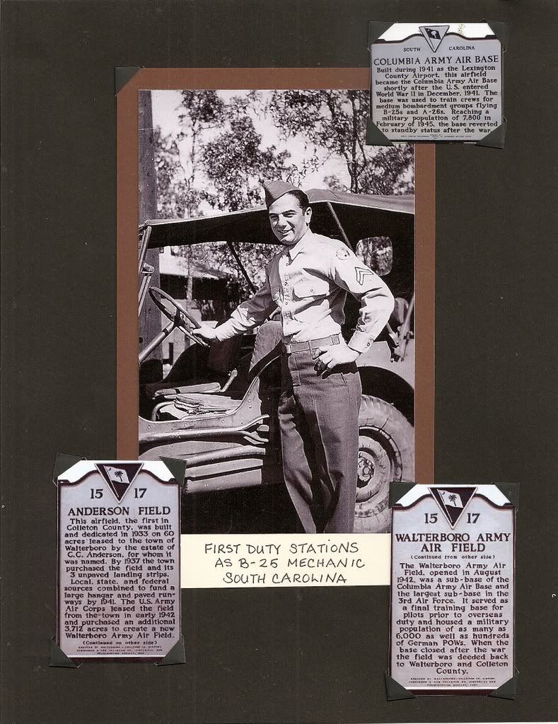
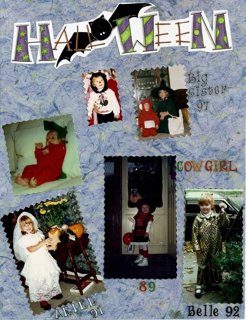
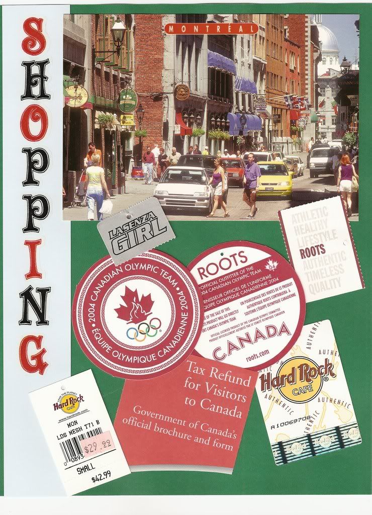
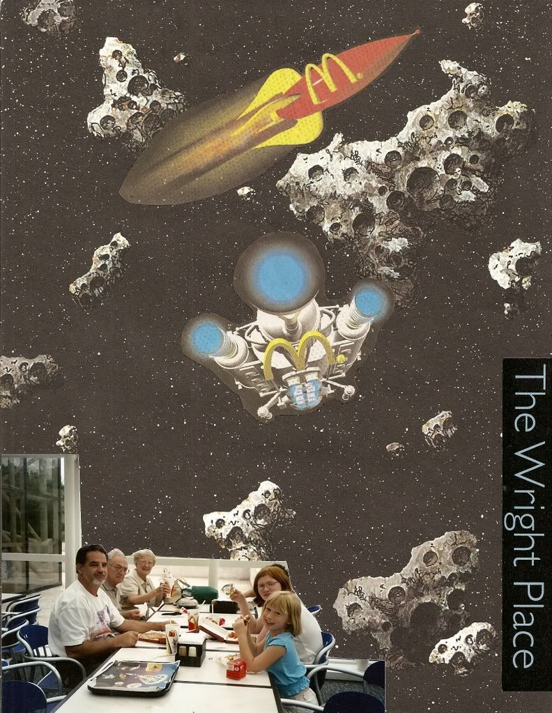
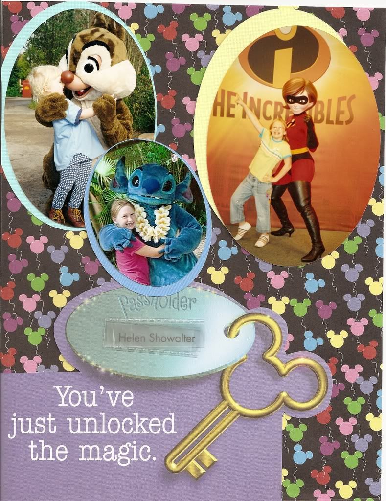
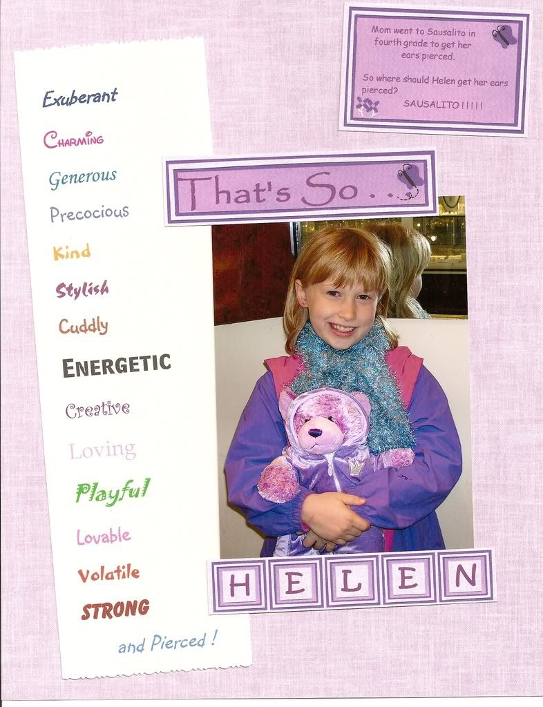
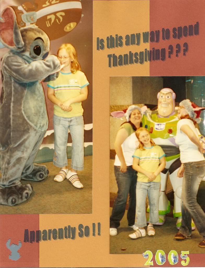
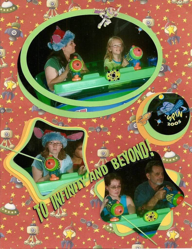
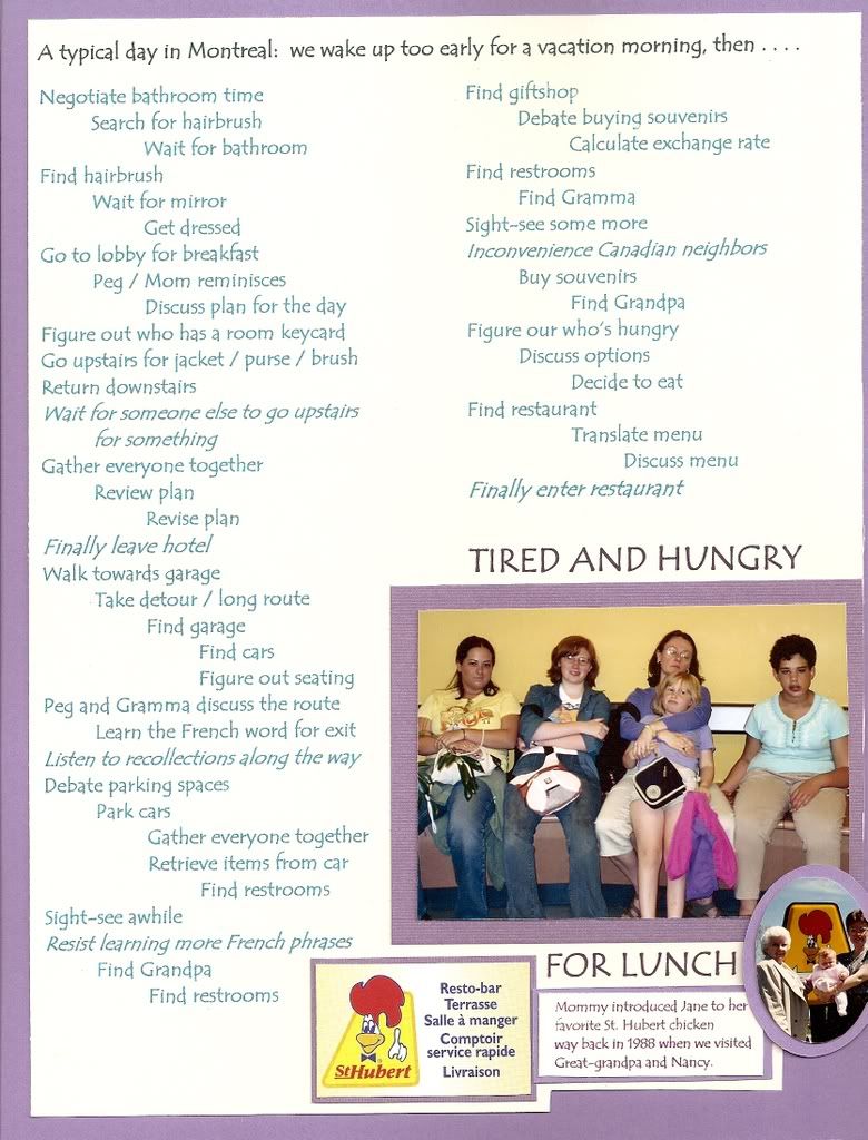
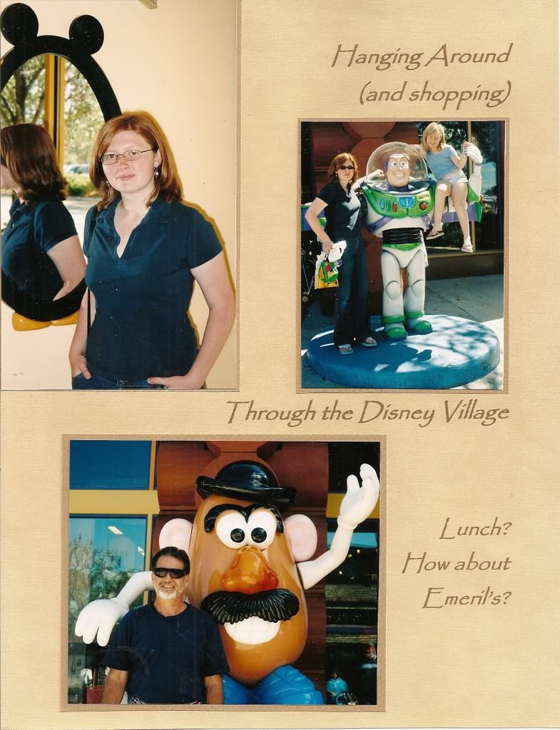
Some energetic photos and events, however just demand busier layouts. I have no formula for my busy pages; they are all different, but in general if I use a brightly patterned background scrapbook paper, I try to use double mats and fewer photos.
I have fun making these busy pages, but not too often.
2/25/2008
2/22/2008
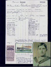
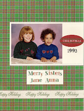
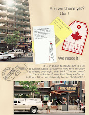
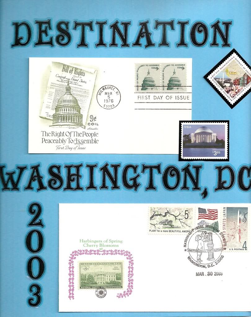
Greeting Cards in Scrapbook Pages
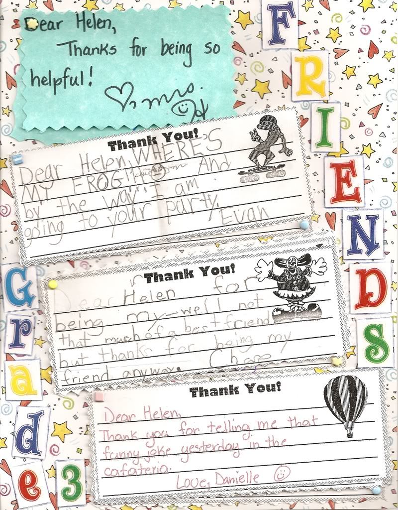
Greeting cards are often too cute, funny, beautiful, memorable, or touching to throw out.
Putting my favorite greeting cards in a scrapbook layout is much preferred to storing them in a drawer or a box.
Displaying both the cover and the inside is solved by cutting along the card's fold. The inside sentiment and signature can have extra way be cropped smaller. If there is print on the inside cover, then the photocopier comes to the rescue.
Photocopying the back of postcards and gift tags also makes them good scrapbook elements.
- All the pieces of the deconstructed greeting card can be used as elements in a scrapbook layout.
- Remember to use matting, especially for the white inside sentiment.
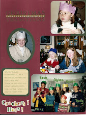
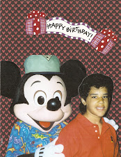
- It works well to include a photo of the person who gave the card, especially for holiday, birthday, christening, or graduation parties.
- Titles and captions seem less necessary on greeting card pages.
Finally, images or quotes from greeting cards can be used as embellishments without including personalization or signatures.
2/10/2008
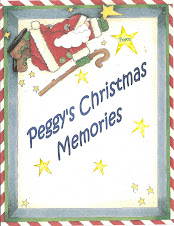
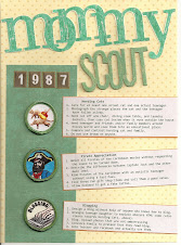
Creating Titles with Word
Most pages need a title, but not big type that stretches across the top of the page like a headline.
- Most of my titles are phrases or captions that fit somewhere within the layout. Some cute titles are stickers or die-cut designs I purchased and worked into the design.
- I have created some titles by using sticker letters. Sticker alphabets limit letter choices (can't use too many a's or e's) and aligning the stickers is pretty work intense, so using stickers keeps the titles short. Now I use stickers only for unique letters.
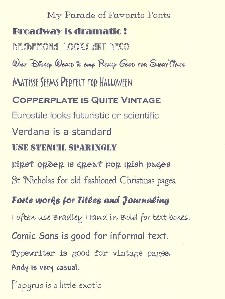
- Most of my titles and captions (well, and journalling too) are created with my Microsoft Word program that I use for my "regular" word processing. Word has features that I never used for my "regular" typing but are great for scrapbooking. I have seen and bought scrapbooking software, but for my text I always return to Word.
Word has great versatility in typeface (font), size, and color. The word toolbar shows the choices. Specialty fonts can be downloaded for free or purchase. My daughters introduced me to http://www.fontface.com/ that has its own free fonts (many of which are "look-alikes" of famous brands or logos) and has links to other sites. With so many free fonts, I have never bought a font. - After typing the title, then I try difficult sizes and fonts to match the style of the font to the style or mood of the page. A font size of 28 to 48 is a good start. Dividing the title into two or three lines often fits on the page better than one lone line. The top line can be in a bigger (or smaller) font size for emphasis. Some words can be bold, italics, or both for effect.
Other features to try
- The "Word Art" feature (found under insert, picture, word art) can produce some very weird or attractive titles, and it takes some practice.
- The border feature (found under format) can be put a border around a title, text, or caption.
- The title can be printed in black or color on cardstock or clear sticker paper and then attached to a scrapbook page. Sometimes I print directly on the scrapbook page, but alignment can be tough.
Experimentation is easy with Word, and my first choices of font, color, size are rarely my final choice.
2/07/2008
Buying Paper
My new job is an easy stroll from a JoAnn's during my lunch time. Browsing Joann's scrapbook supply aisles is always fun, but today was a paper sale: fun and dangerous. A practical scrapbooker like me knows that solids and simple tonal patterns make layouts easy, but many pretty patterned papers are so tempting to buy.
I know that if I buy pretty or dramatic patterned paper with a specific project in mind, the paper gets used in a layout. When I buy the pretty or dramatic patterned paper without a specific plan, I get to admire the paper for months or years in my paper filing cabinet (yes I have a filing cabinet for paper) without ever finding the inspiration. in my photos to actually use the paper on layouts.
At Joann's I found padded "Stacks" of Christmas paper at a large discount. Pads of solid cardstock are a great bargain because the colors are useable year and theme round. I can cut the 12x12 to 8 1/2 x 11 and use the extra for trim and mats. Pads of 4x6 cardstock is a great bargain too. Two easy purchases. My struggle is "The Stack" of assorted solids and prints, with solids and subtle prints, a few some prints I would never use, and so many adorable printed papers that I have no idea how to use as background for a layout. Does my filing cabinet need more paper ? But it's cute paper.........to buy or not to buy.......I'll decide during my lunch walk tomorrow.
Subscribe to:
Posts (Atom)


